The Client:
Yaniv Shami, an insurance and finance agent specializing in advanced financial and investment solutions.
The Request:
The Challenge:
Working with metallic tones, especially gold, presents a complex technical and visual challenge. Gold is a deceptive color, and when used incorrectly, it can appear dull, too yellow, or illegible, particularly on light backgrounds. The task was to find the precise range of gold tones so that the result would appear premium both in print and digital display. Beyond the color aspect, the challenge was to create a versatile symbol that succeeds in looking good on any background—white, black, or colored—to ensure consistent branding at every customer touchpoint with the brand, regardless of production limitations or medium.
Evolution of Versions and Revisions:
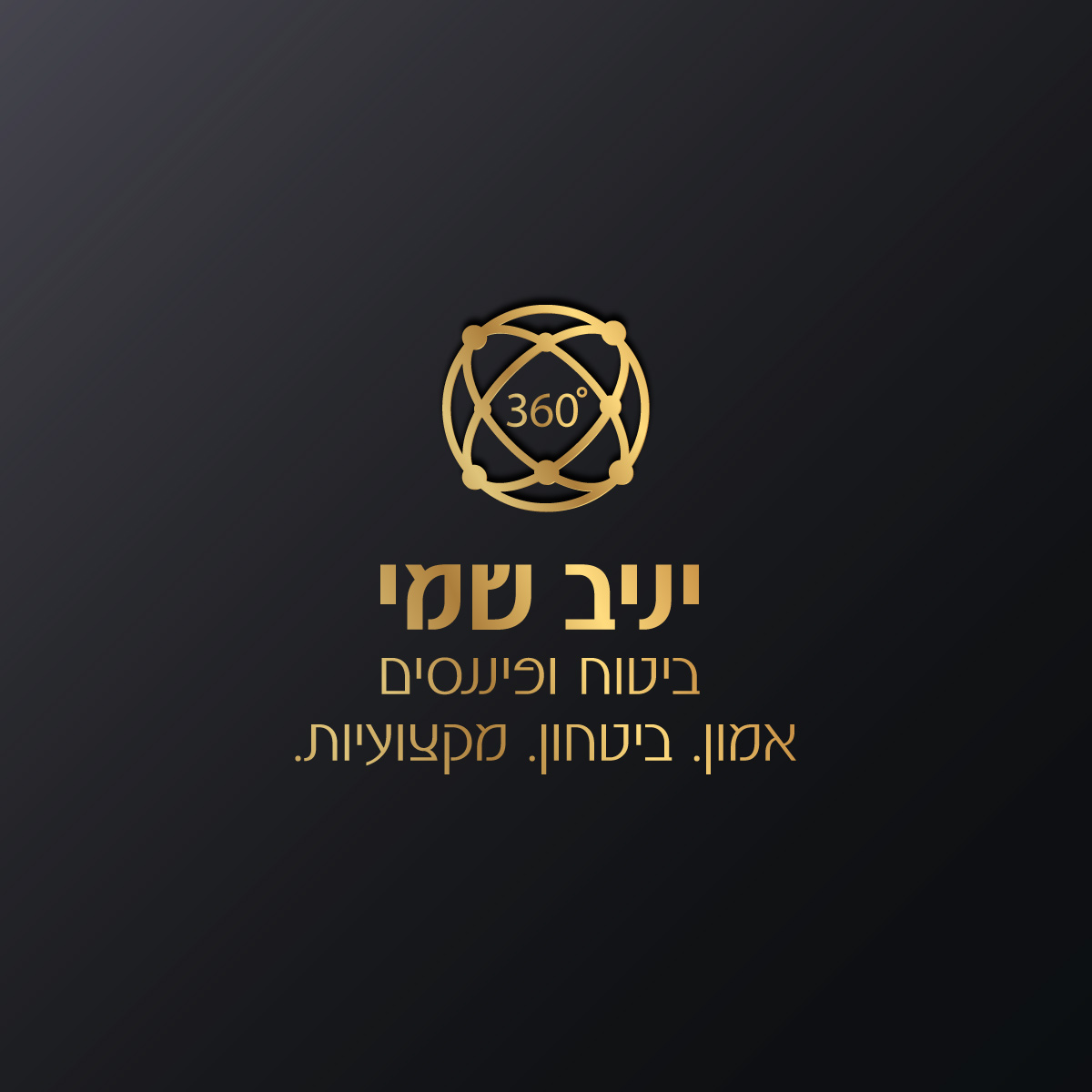
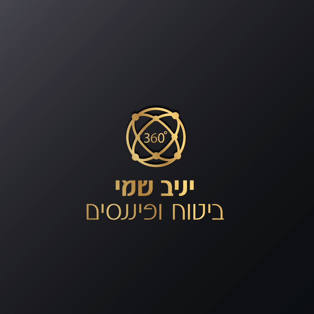
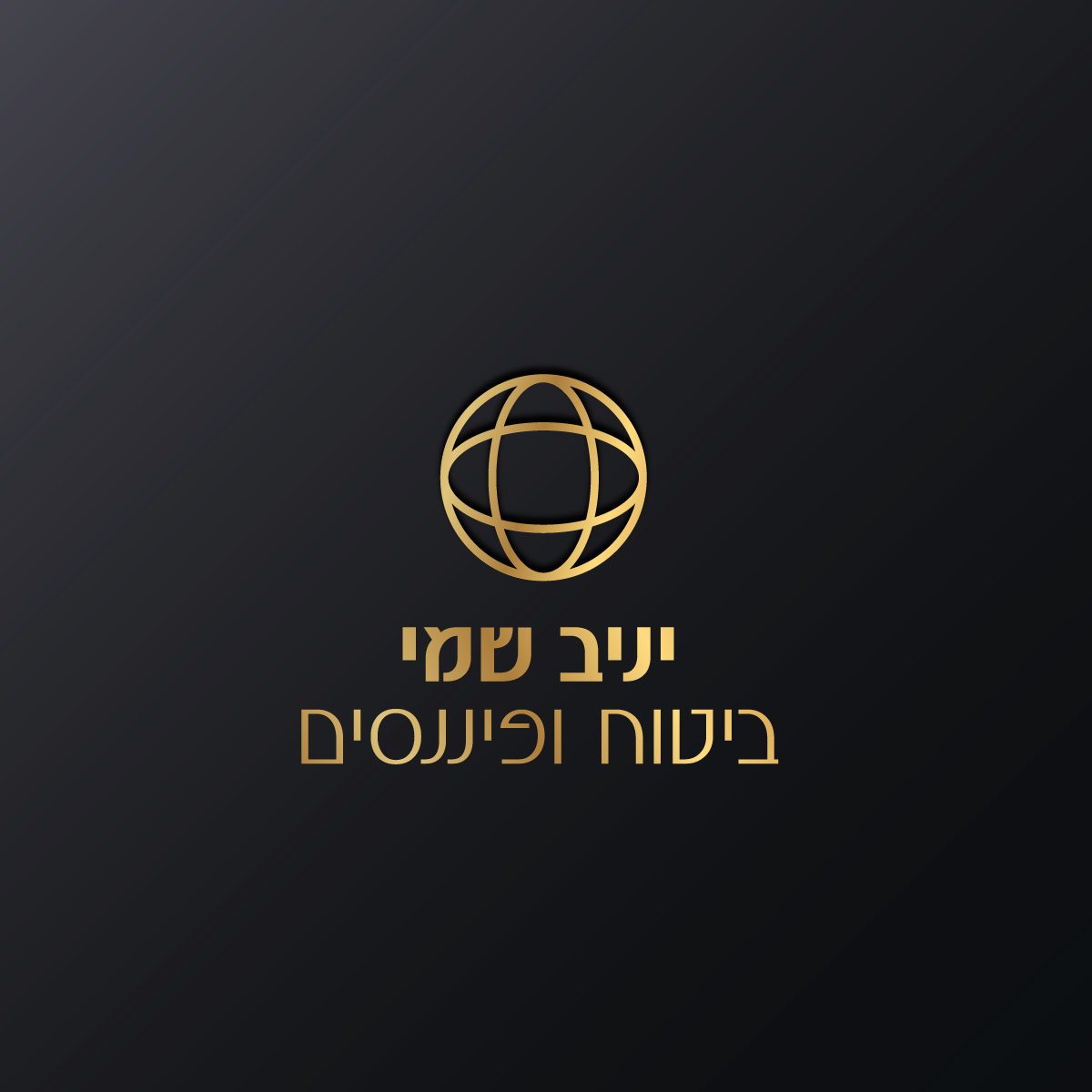
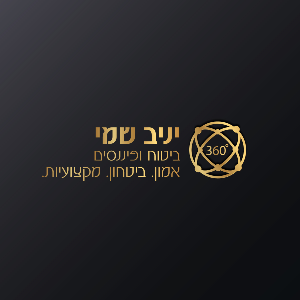
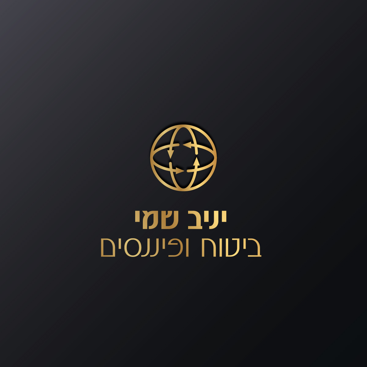
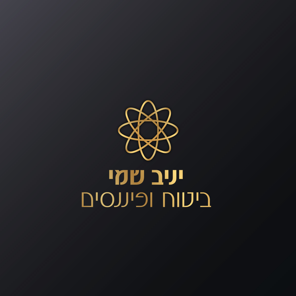
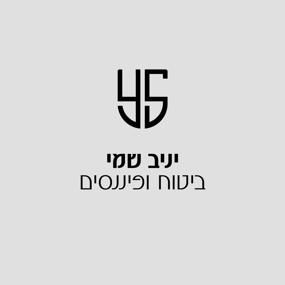
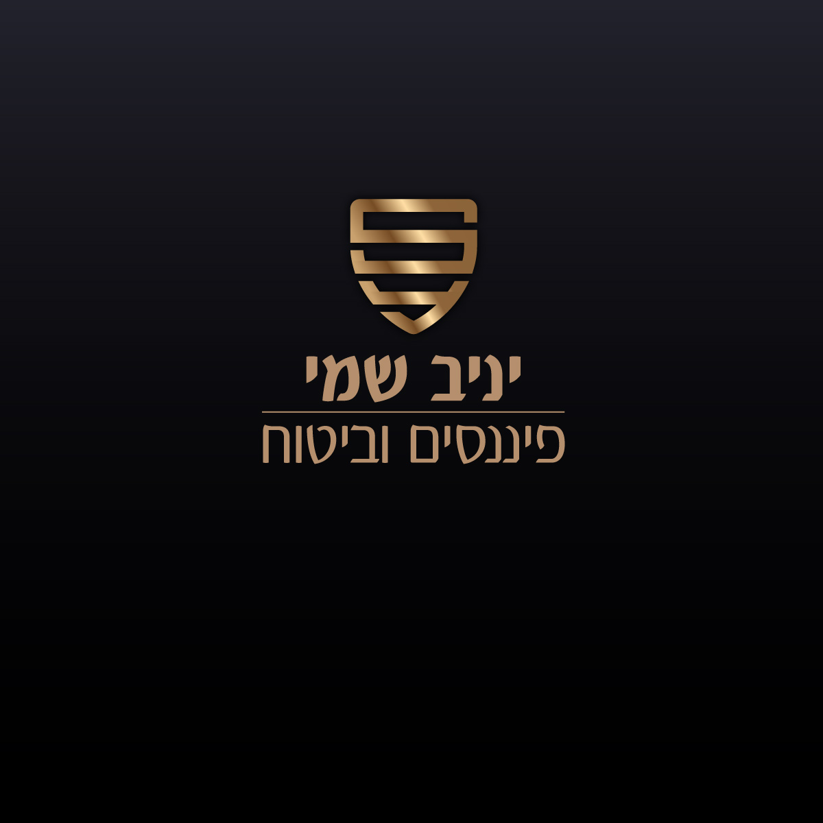
The development process focused on refining the graphic symbol that would accompany the name. The client arrived with a very clear vision: he wanted the logo to reflect his service philosophy—a 360-degree solution encompassing all the insured’s needs. During the work, several directions were examined for incorporating the motif of circularity and protection. One version focused on an atomic-circular symbol representing connectivity, while another presented a shield incorporating the client’s initials within a strong geometric structure. The client insisted on explicitly incorporating the 360° notation within the composition, which led us to a series of sketches seeking the balance between typography and symbol. Throughout the process, clear focus was maintained on designing an insurance agent logo that would successfully convey both a broad service envelope and a sense of stability and security.
The Final Result: