
Client:
“In the Headlines” – News Portal
The client is a media organization operating a dynamic news portal, based on continuous updates, multiple reporters, and hundreds of items published weekly. The primary need was a stable platform capable of handling the volume of information without compromising speed or digital aesthetics. The primary need was a stable platform capable of handling the volume of information without compromising speed or digital aesthetics.
Request:
The requirement was to establish a well-oiled “content machine.” The client sought a digital framework that would enable maximum exposure to a large volume of news items on one hand, while providing users with a sense of order and ease on the other. Special emphasis was placed on integrating advertising banners as an integral part of the design, generating revenue without compromising the reading experience.
Challenge:
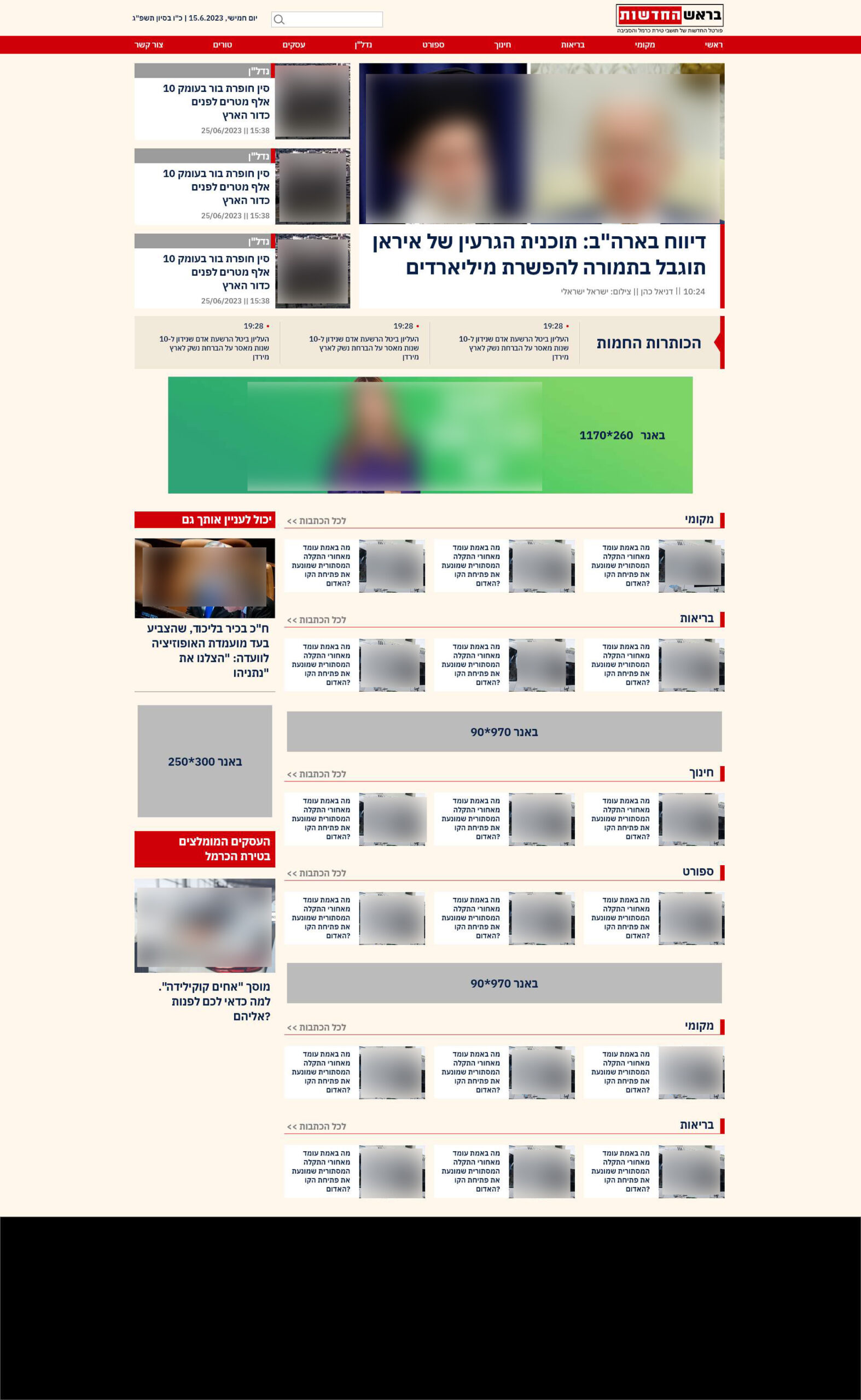
The main challenge in projects of this scale is “visual noise.” When there are numerous items, images, and headlines, it is very easy for a site to appear cluttered and overwhelming. We needed to create a clear visual hierarchy to guide the user’s eye from the main story to secondary sections.
Additionally, the most significant UI/UX challenge was banner placement. In a news portal, advertisements are essential, but they tend to dominate the space. The task was to create a smart “construction”—ad zones prominent enough for advertisers, yet integrated into the overall grid in a harmonious way that does not strain the eye.
Evolution of Versions and Revisions:
The work process involved examining multiple design concepts. In the early stages, we focused on differentiating the site from direct competitors in the digital press market. We conducted extensive experiments with color schemes—testing how different background colors affect text readability over time and how color can be used to separate content areas (such as sports, current affairs, and economics) without creating a “circus” of colors.
In each version, we refined the spacing (white space) between items to give the content “breathing room.” We moved from compressed layouts to a modular grid structure that allows flexibility on days with breaking news versus quieter days.
The Final Result:
An advanced, remarkably clean and organized news platform was achieved. The site successfully presents a vast amount of information in a hierarchical and clear manner, with advertising banners becoming part of the page’s natural flow. The result is a site that looks and feels like a premium magazine—prestigious, organized, and visually pleasing, providing the client with the tools to manage complex content easily and professionally.
View the Live Website>>
